Visual Identity / Wayfinding for Grudza83 Bike Point
brand / wayfinding / webdesign / print / social media / art direction
ABOUT
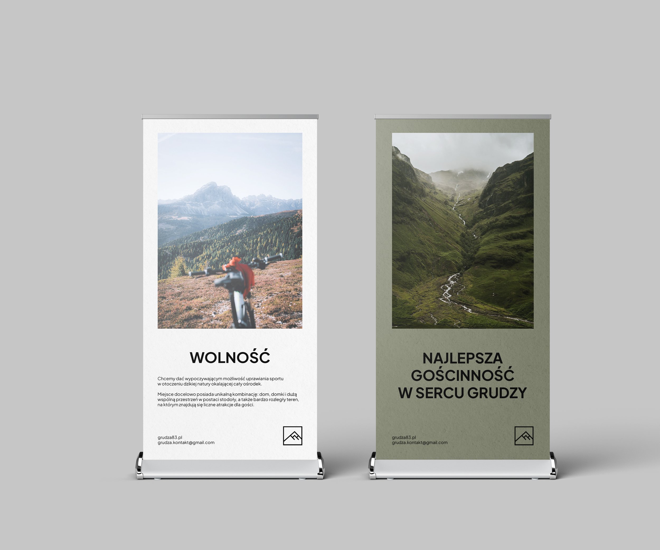
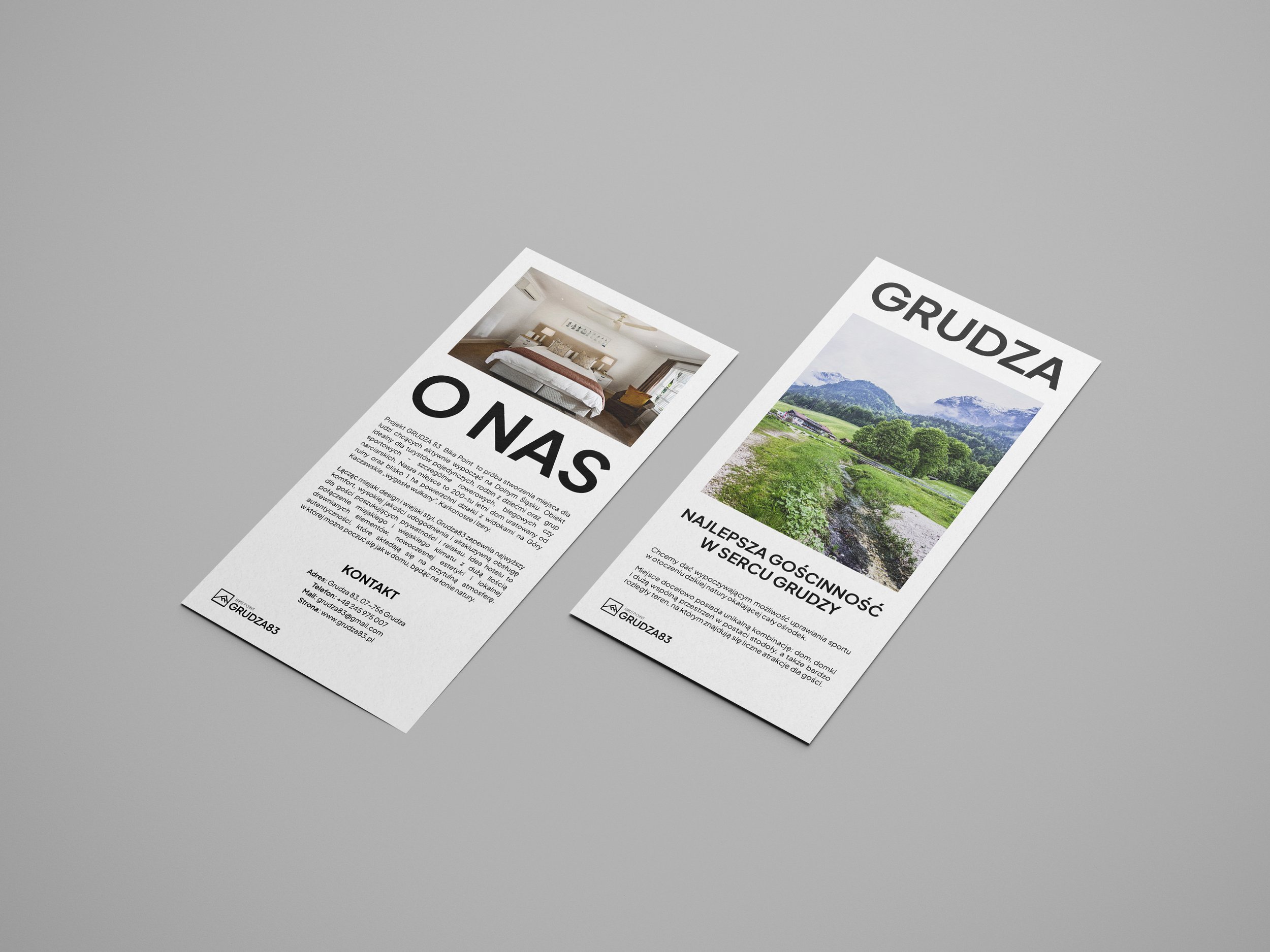
The GRUDZA 83 Bike Point project is an attempt to create a place for people who want to actively relax in Dolny Śląsk. The facility is ideal for single tourists, families with children and sports groups - especially cycling ones. It creates an authentic place among mountains and forests, approximately 20 km from the nearest cities, giving guests a sense of freedom and privacy on an hectare of space for rest and recreation. Ultimately, the place has a unique combination: a house, cottages and a large common space in the form of a barn, as well as a very large area with numerous attractions for guests.
TASK
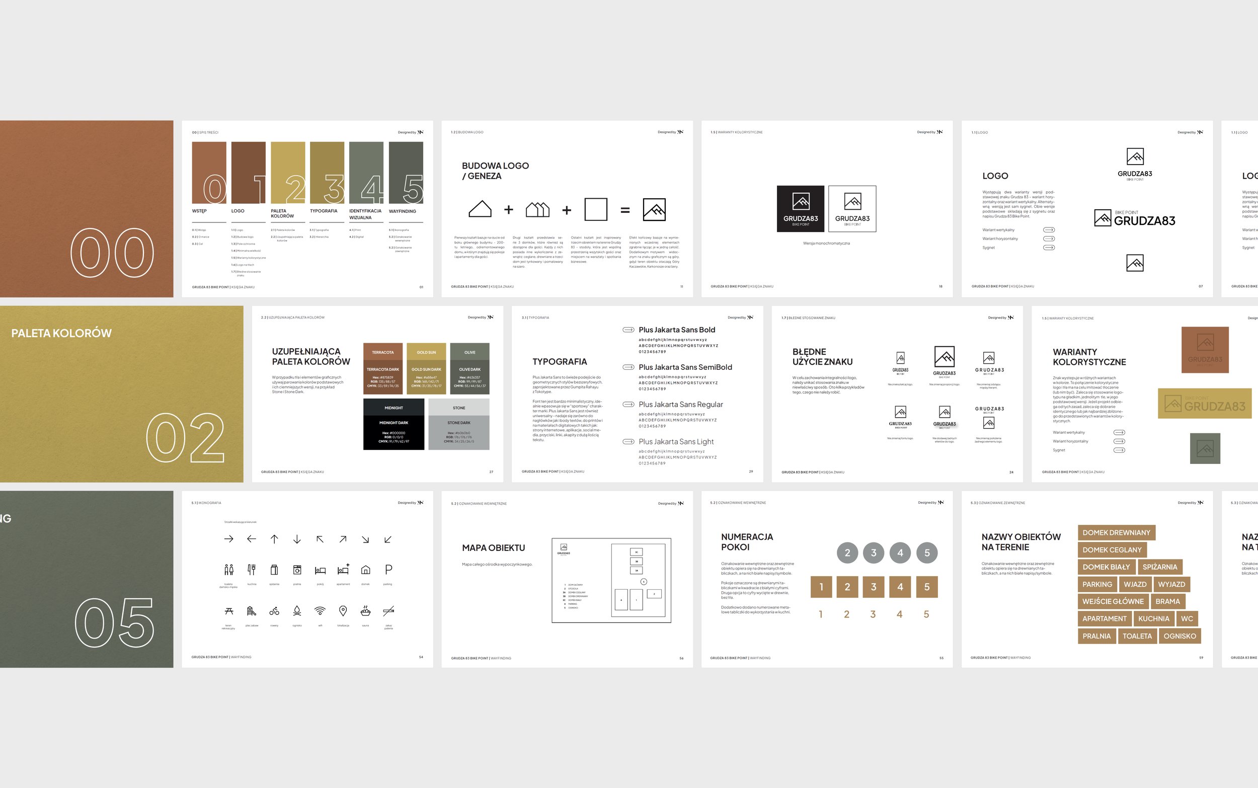
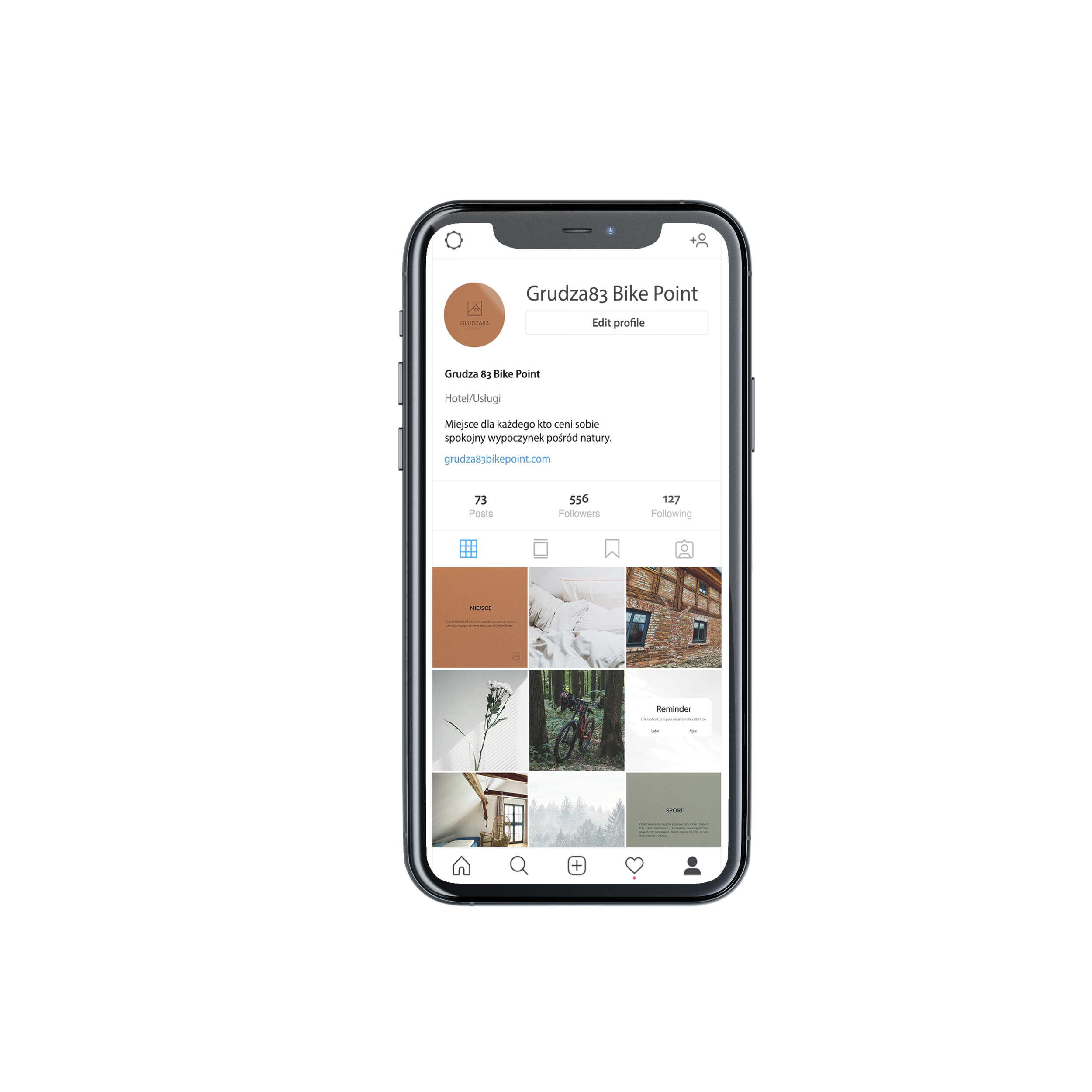
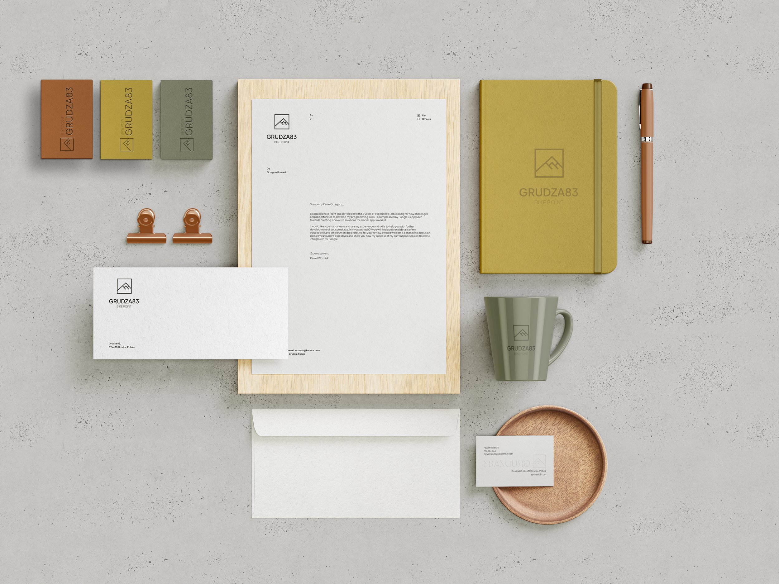
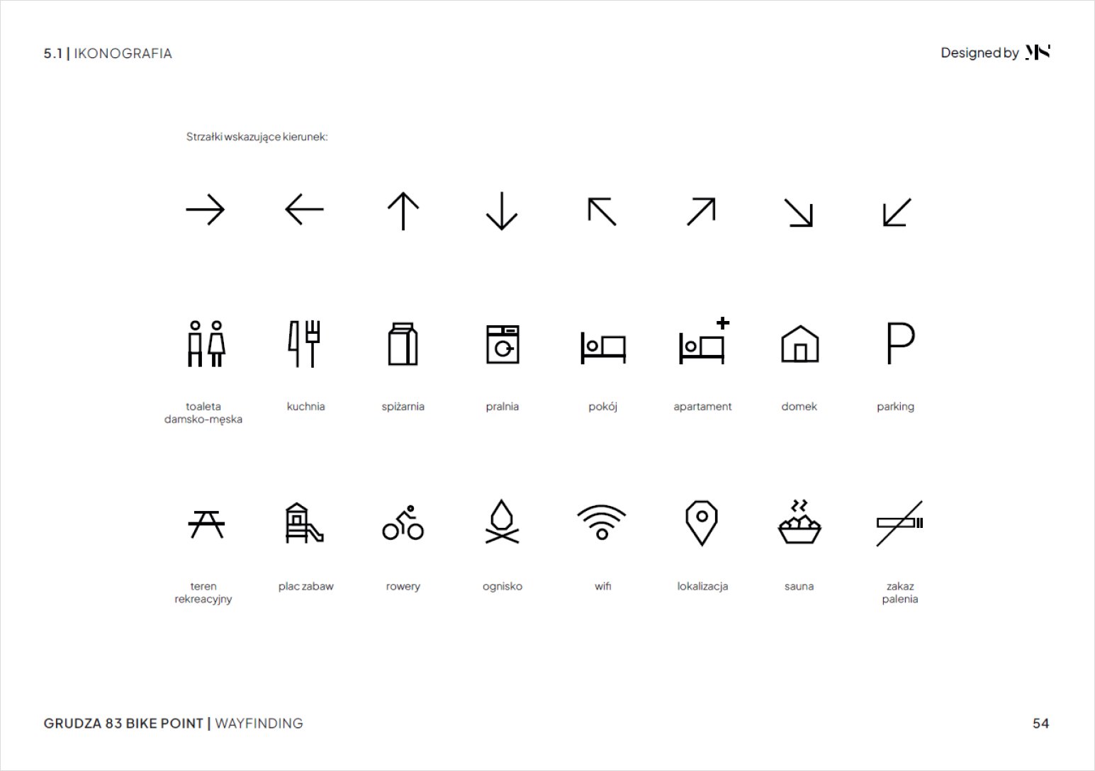
The project requirement was to create a logo with a brand book, the entire visual identification, including printed and digital materials, and graphic support in creating a new website. In addition, a coherent visual information system was designed - wayfinding of the object along with iconography. The task was based on a prior interview with the client and selecting an appropriate brand strategy.
Key directions: warmth, return to nature, freedom, privacy, timeless design, minimalism, sporty accent
SOLUTION
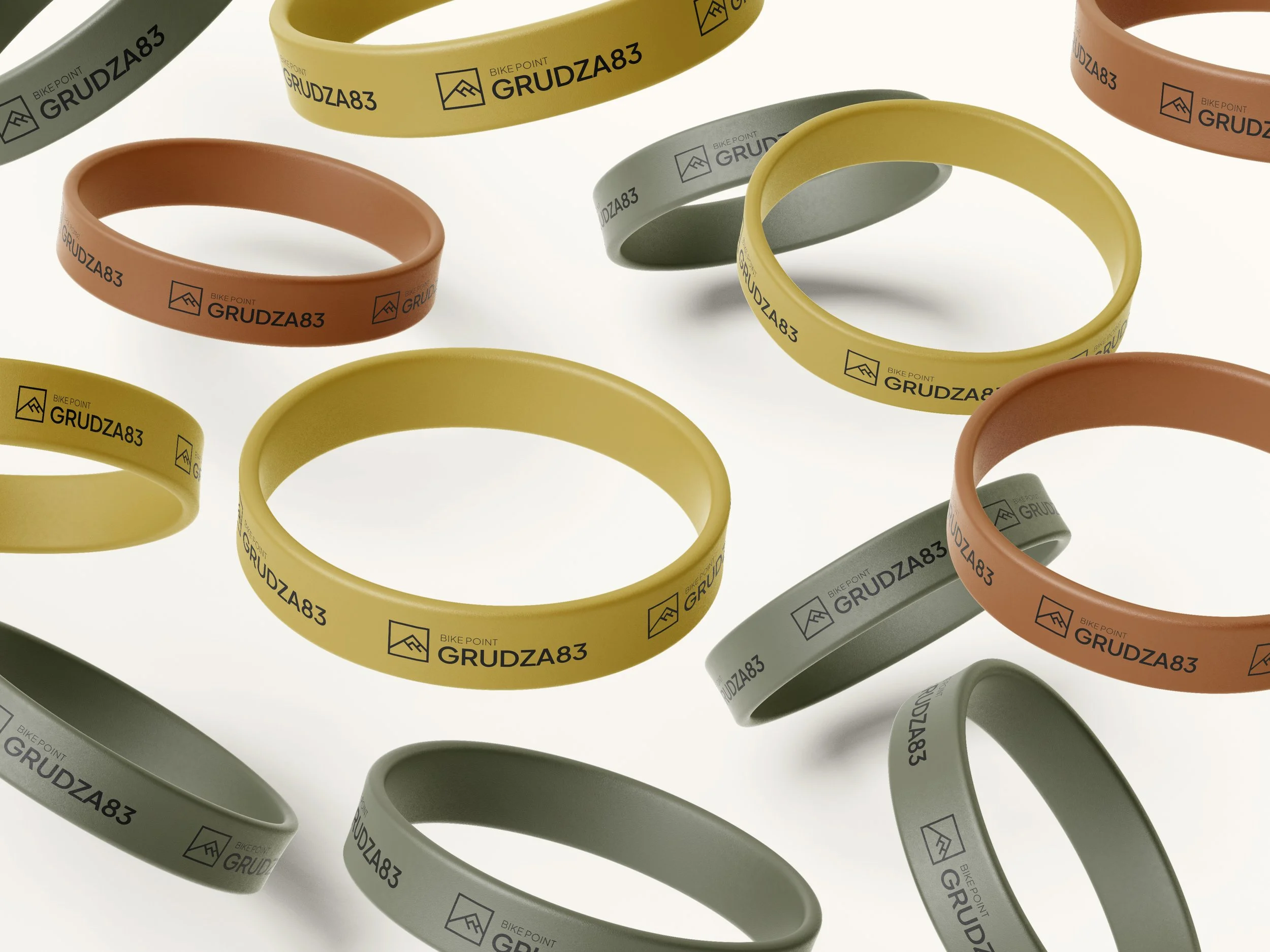
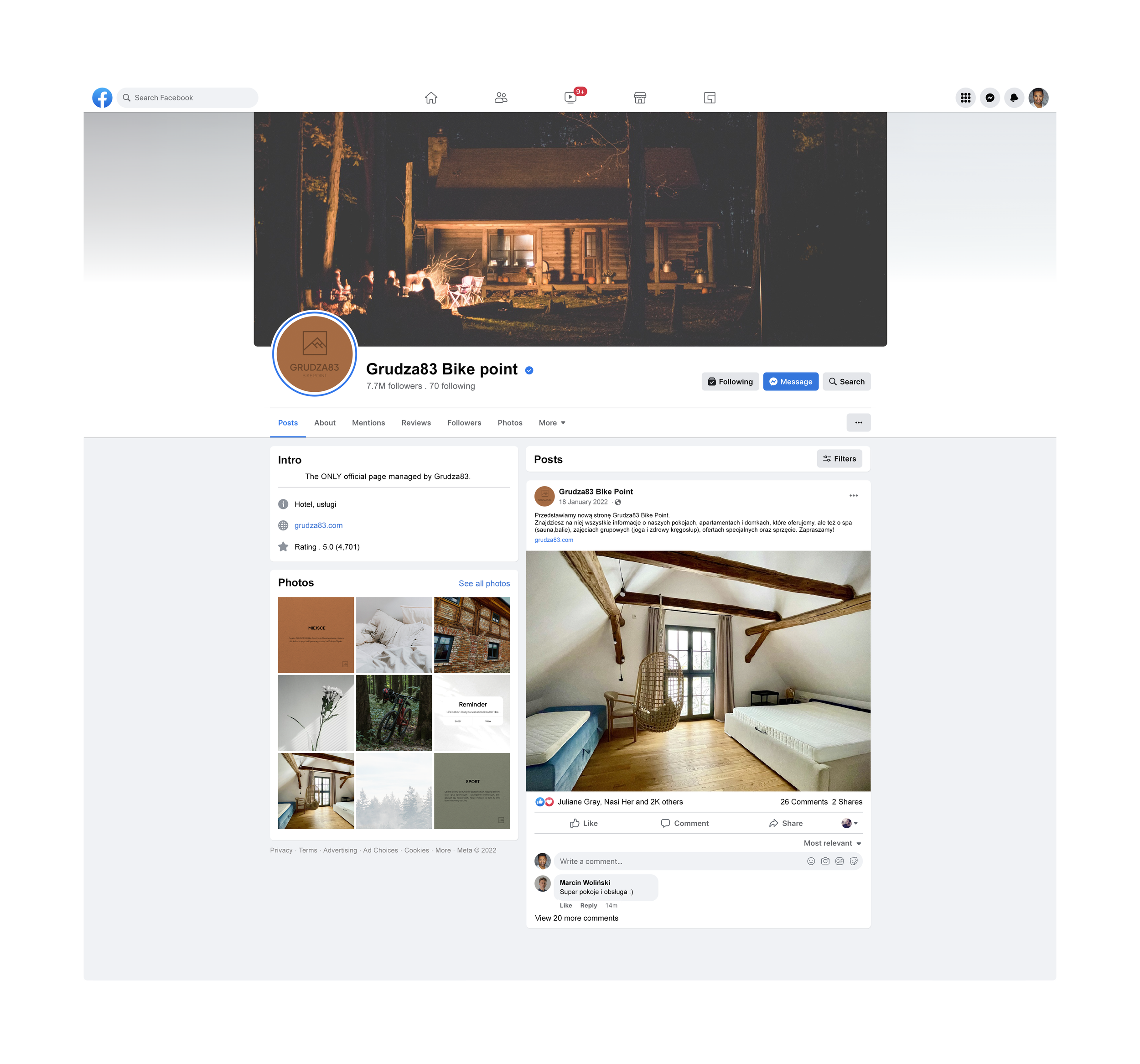
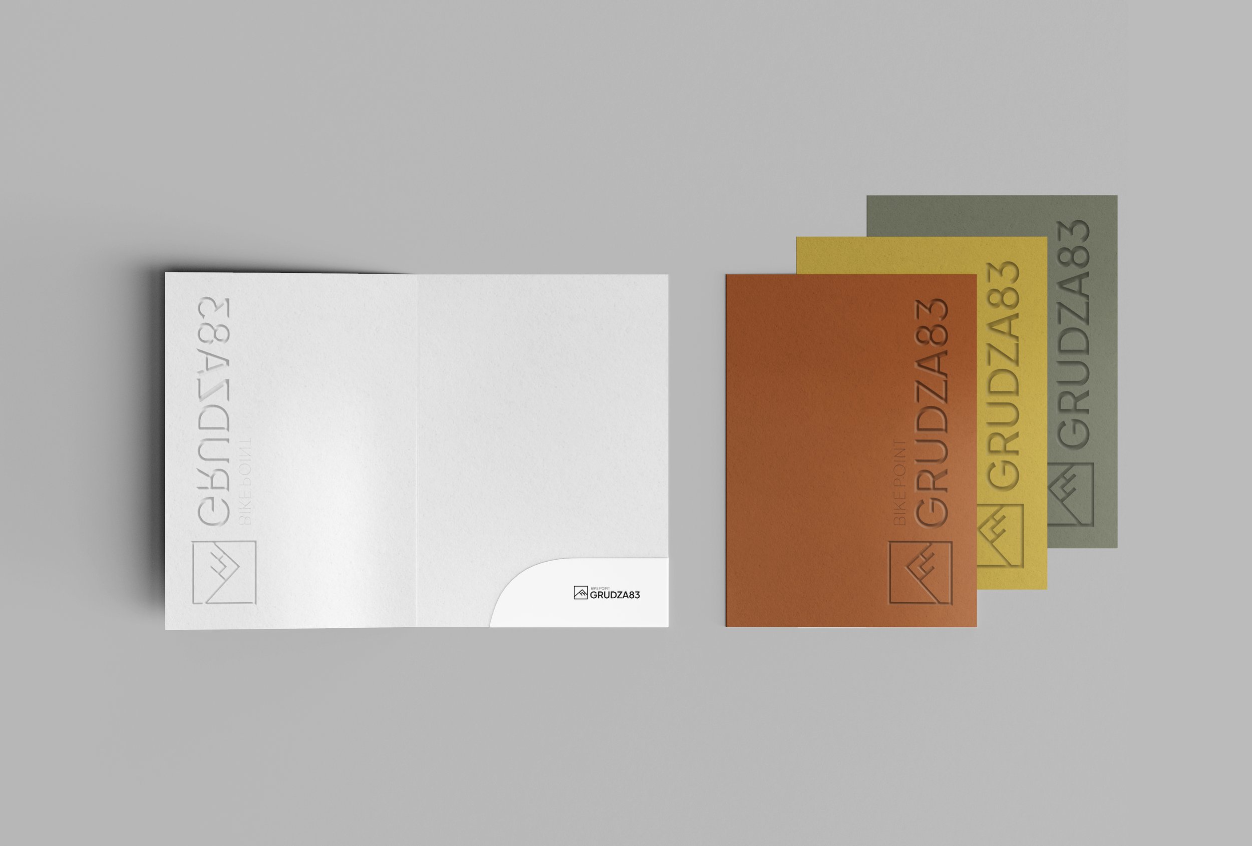
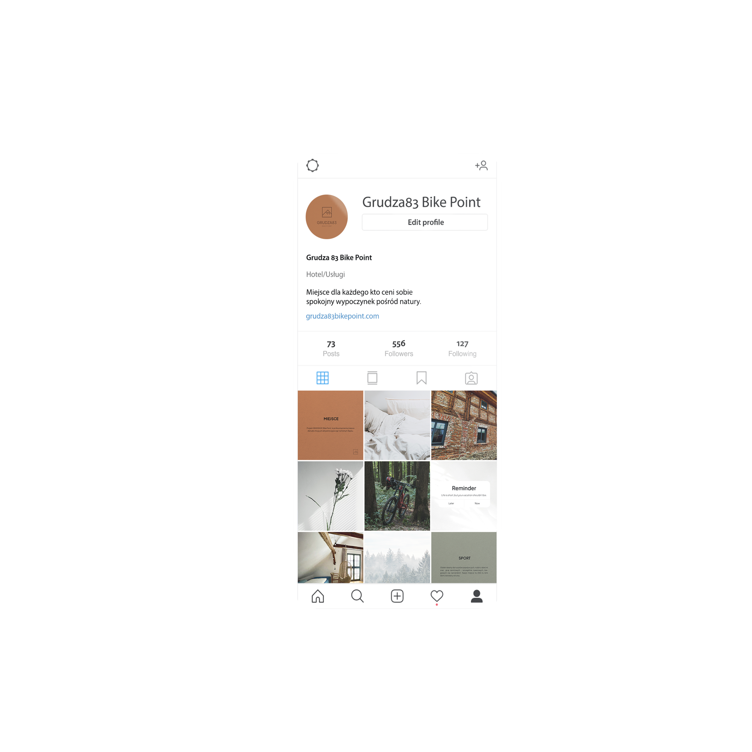
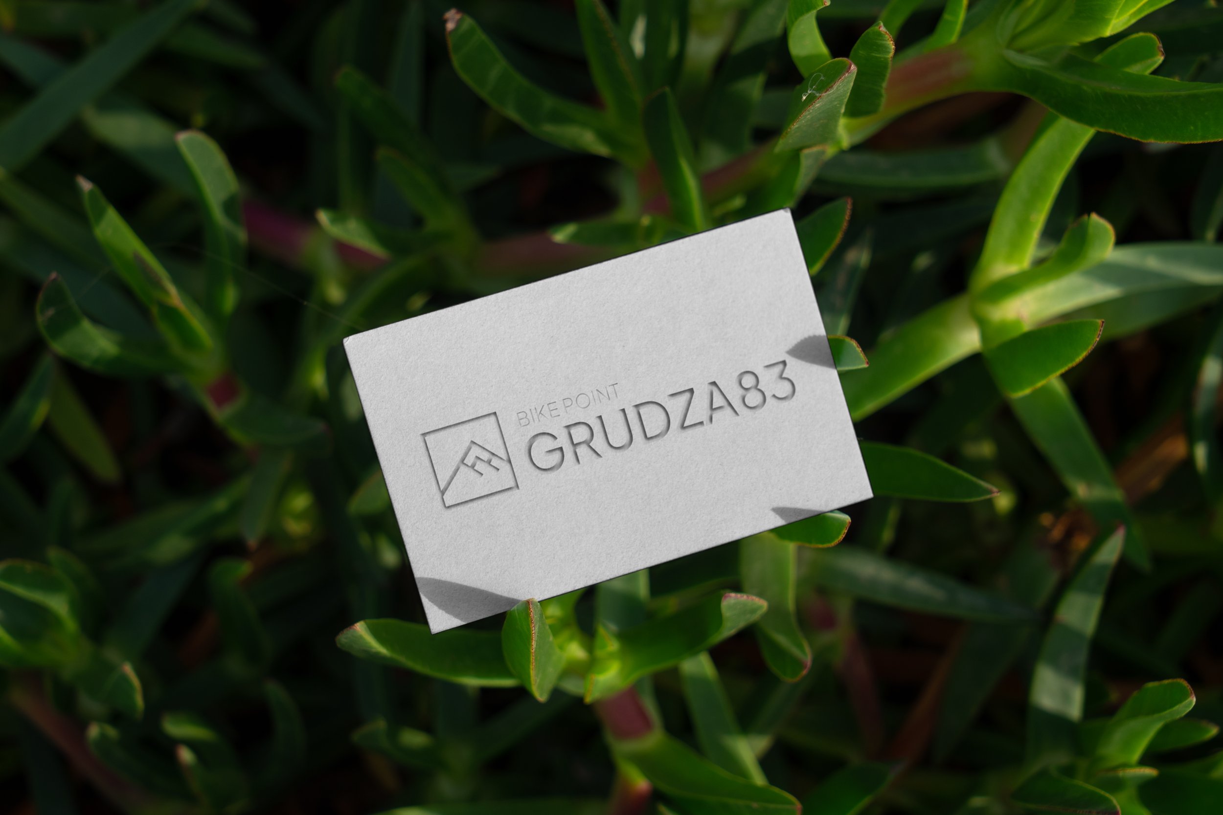
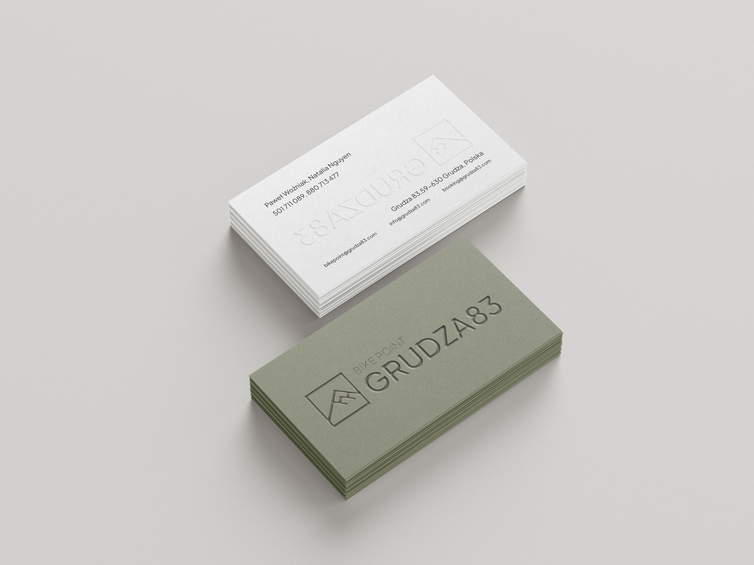
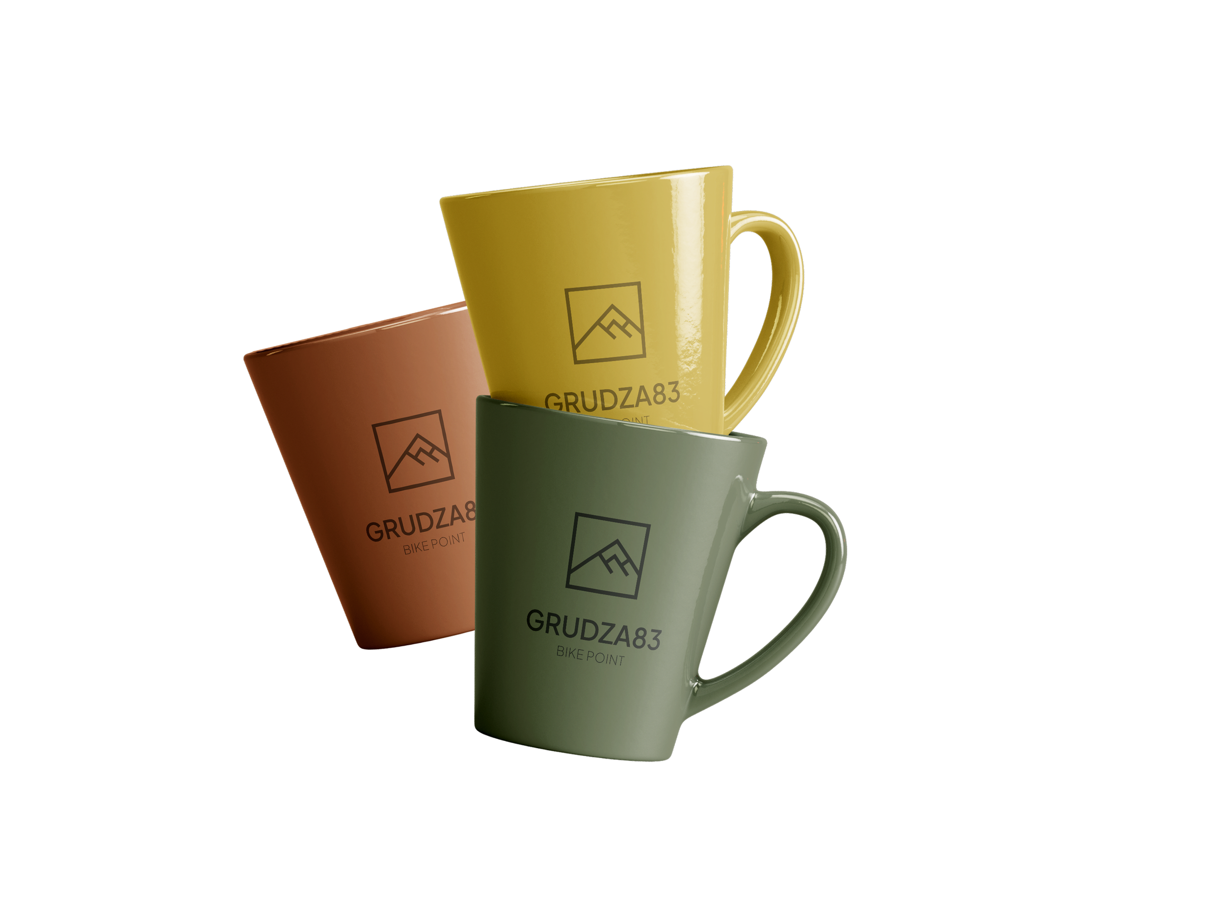
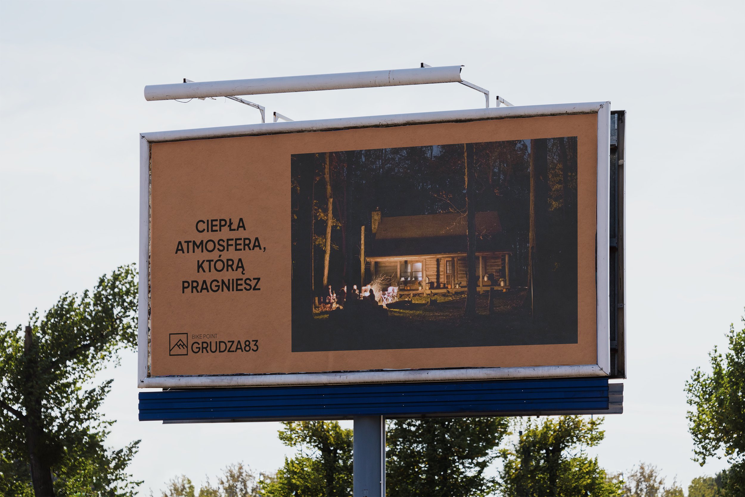
The purpose of the brand's visual identification was to communicate the philosophy of Grudza83 as a brand, not just a hotel. To achieve this, a diverse color palette and simple typography were used. The colors are inspired by the materials used to build the facility, such as stone, brick, wood, and the colors of earth and nature referring to the surroundings. The logo is based on a sign referring to the construction of the hotel and the parts that make up the entire property, as well as sans-serif, minimalist typography. Also we built a website grudza83.com.