Epil & Care
rebrand / webdesign / print / social media / art direction
ABOUT
The Epil & Care is a place for people who want to find their beauty, well-being and take care of their body and skin.This salon is a unique place that helps you rebuild your self-confidence, fight complexes, and take care of your needs and body. The entire staff creates a place full of passion and care for the skin. The team creating the brand consists of people focused on development and deepening knowledge, thanks to which customers enjoy the best results.
TASK
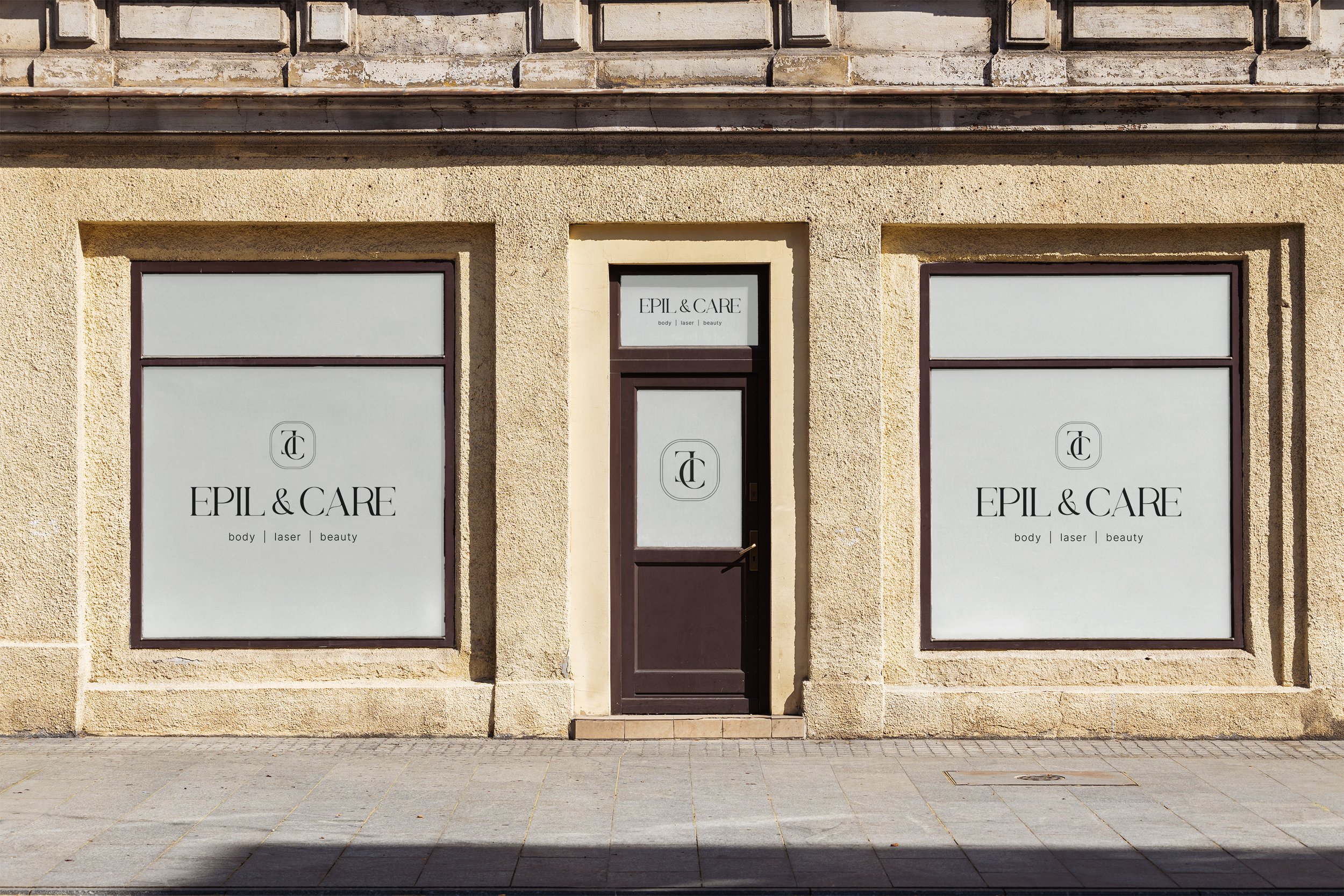
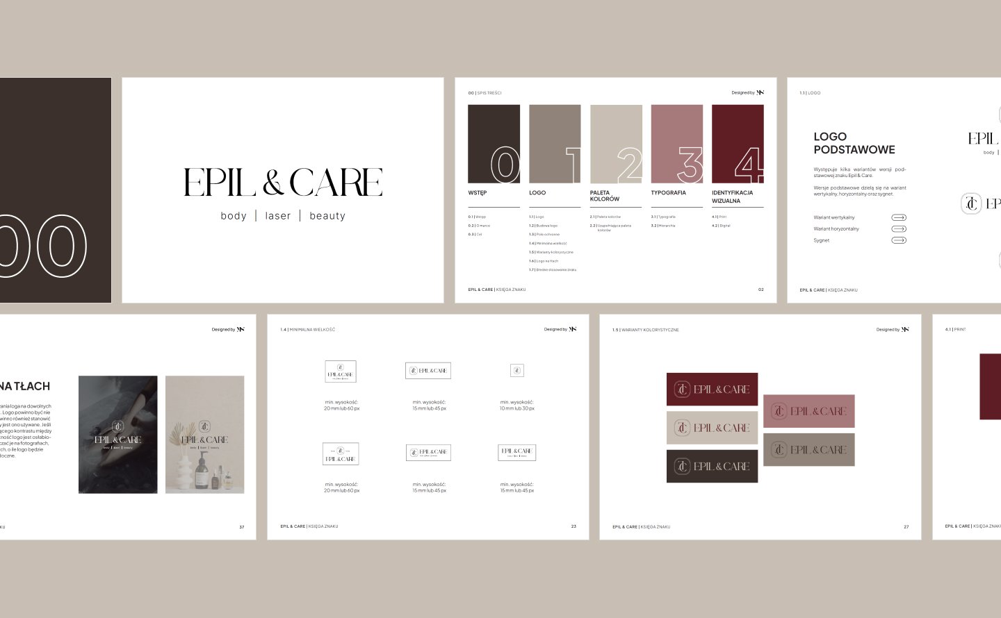
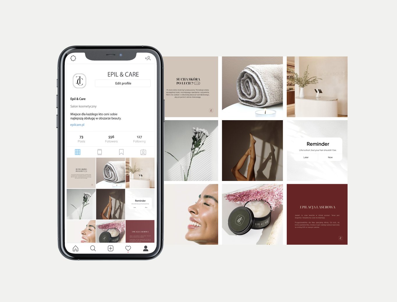
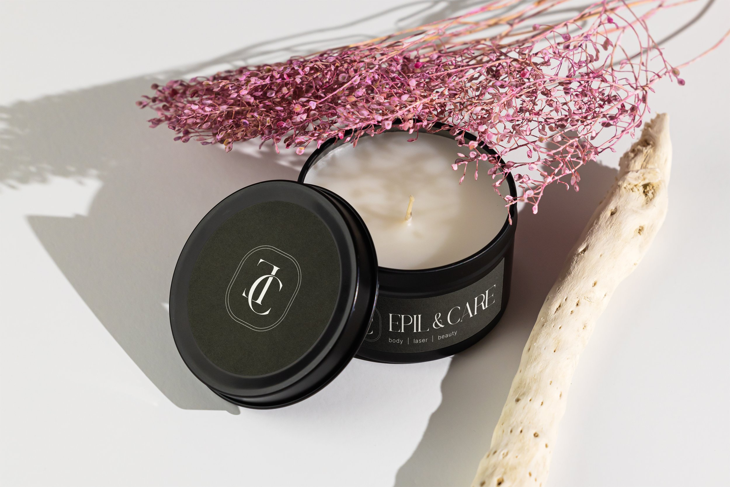
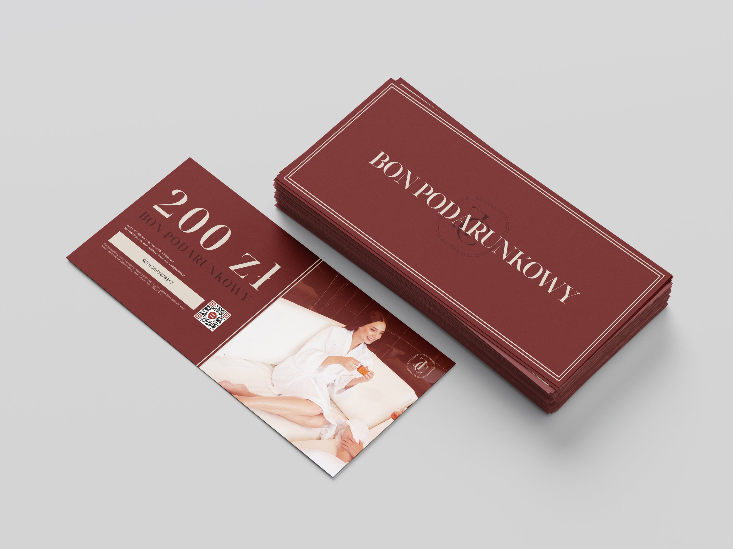
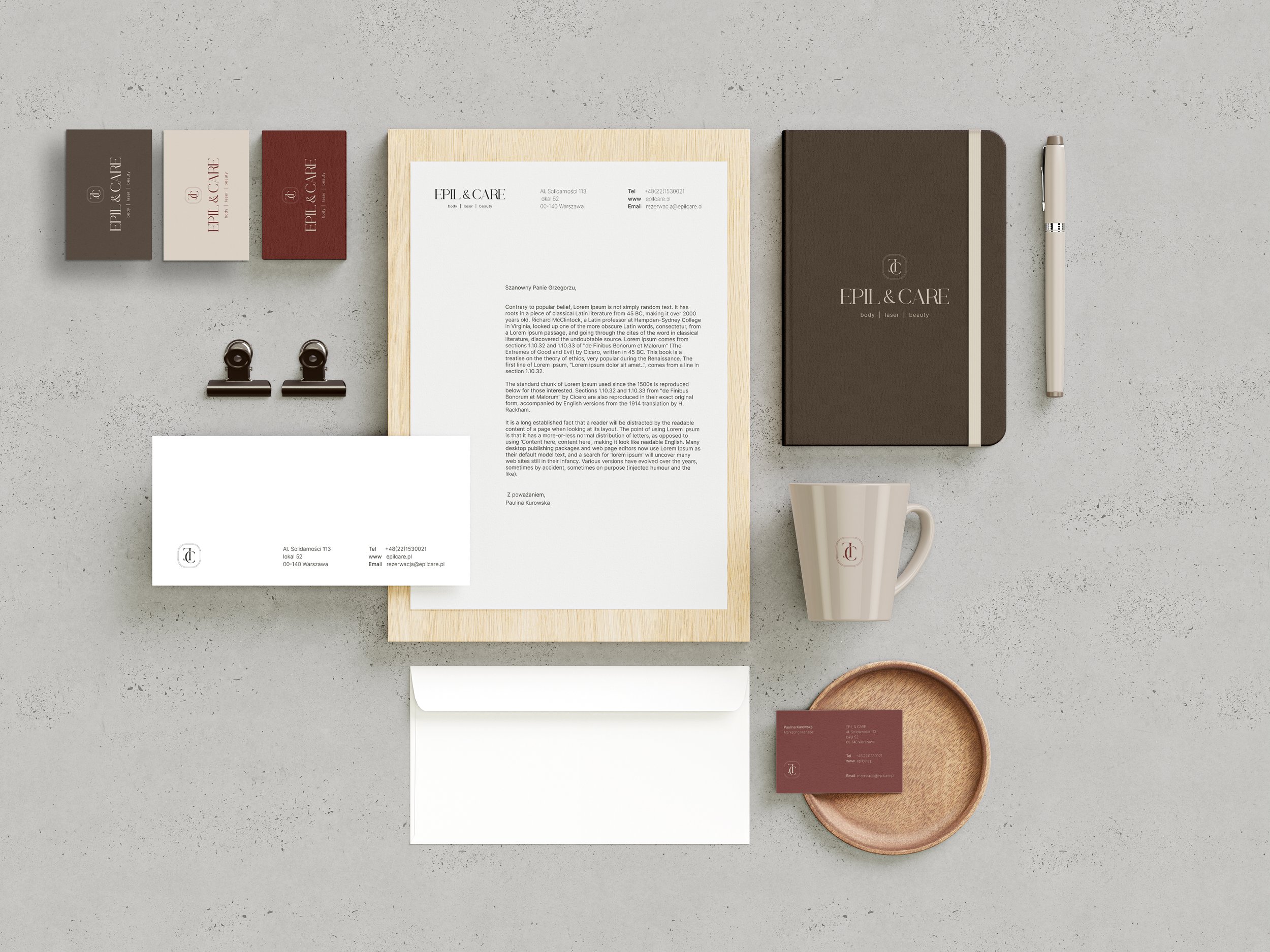
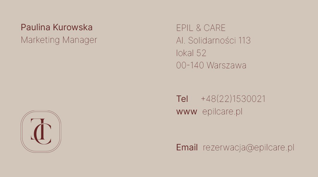
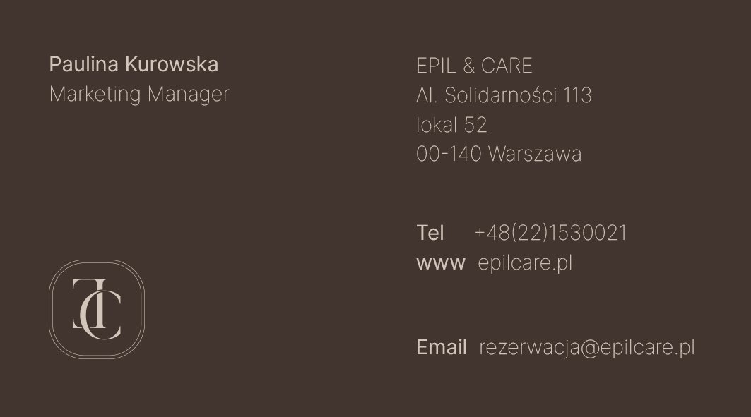
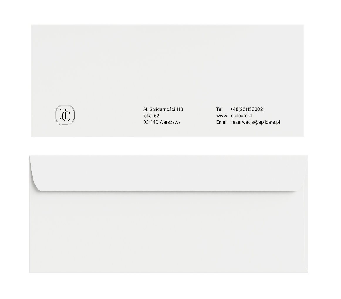
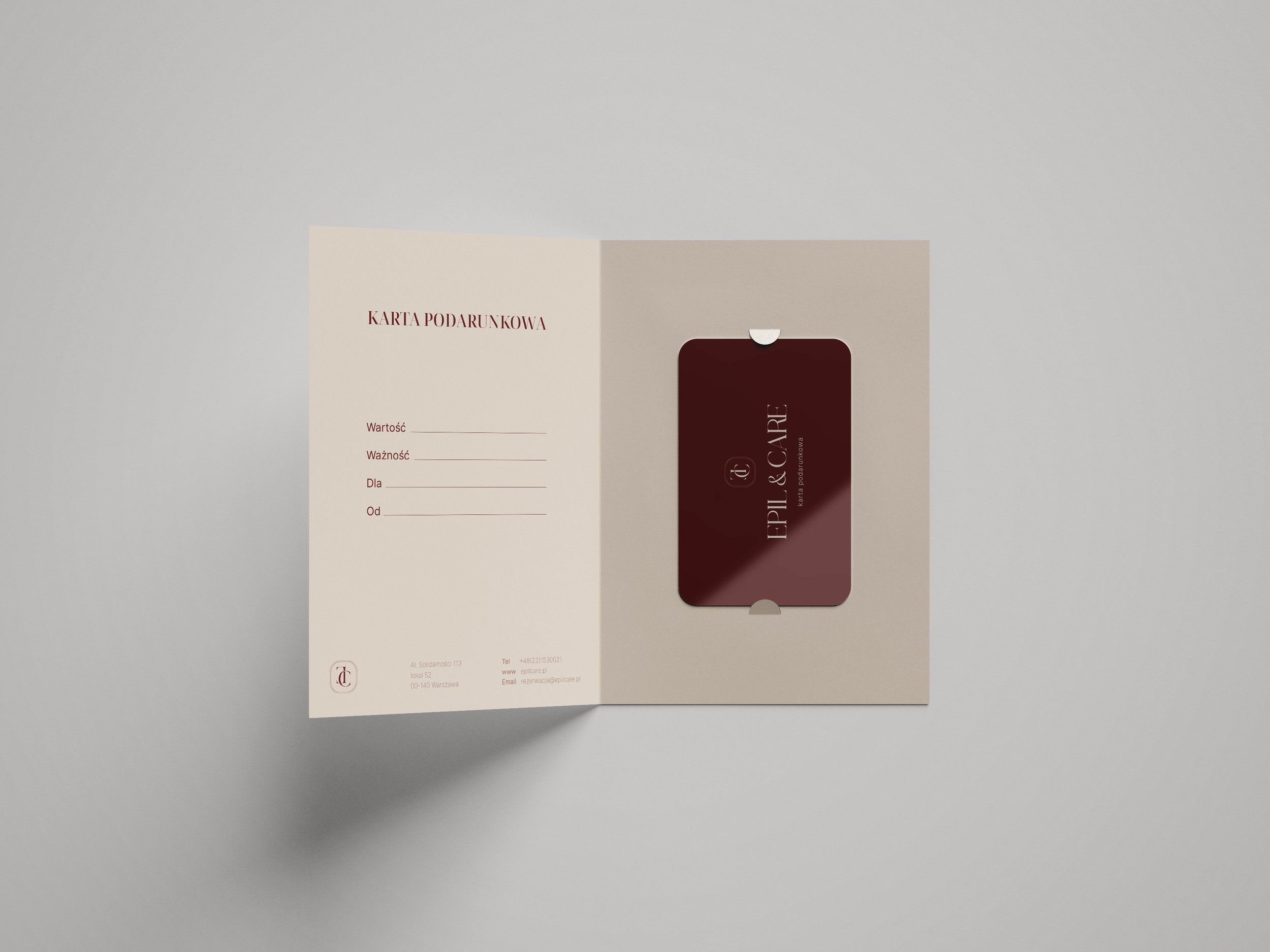
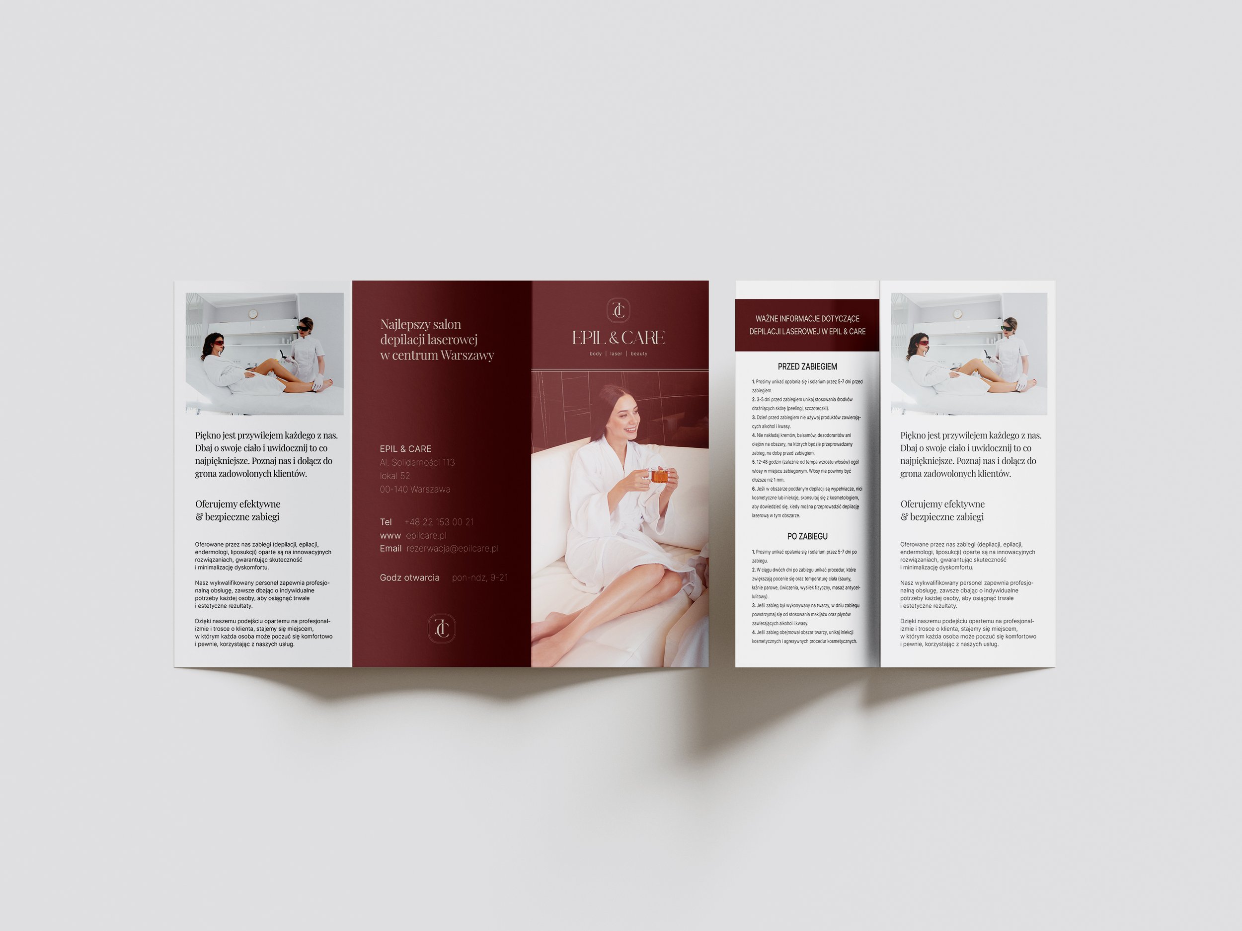
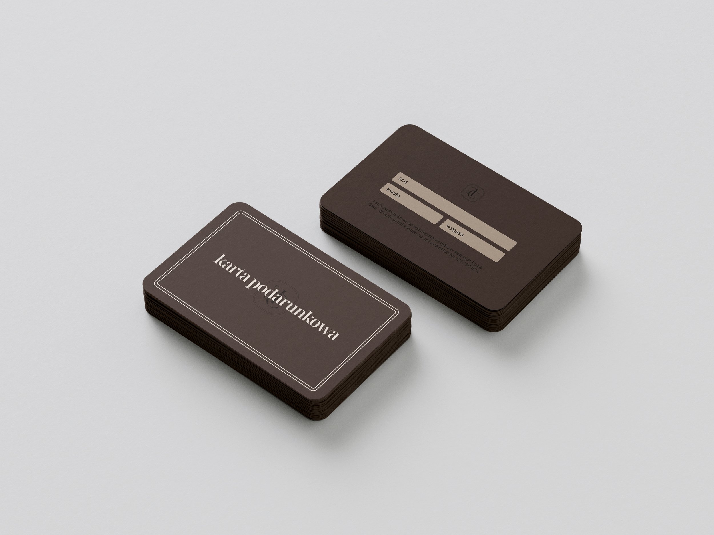
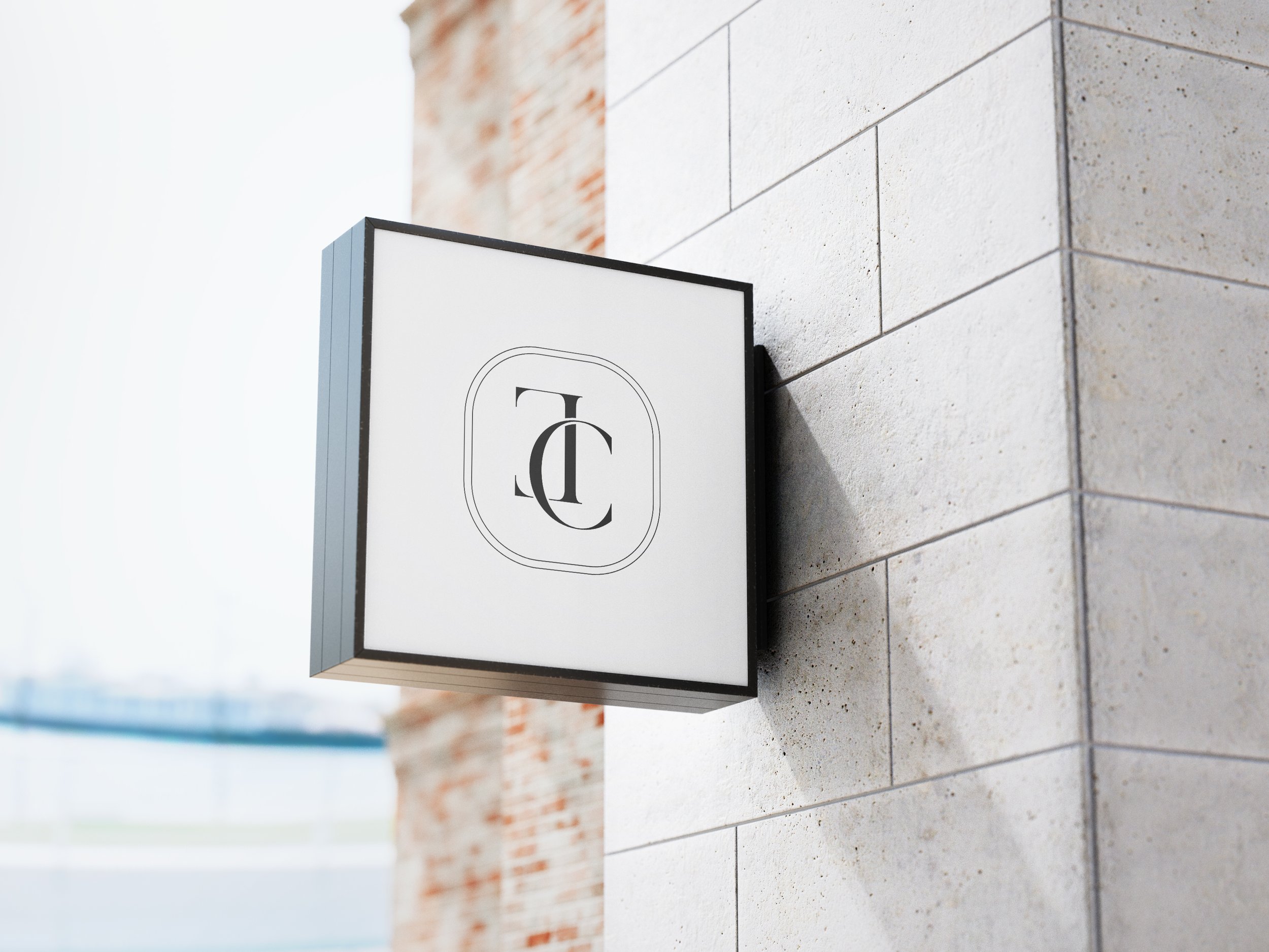
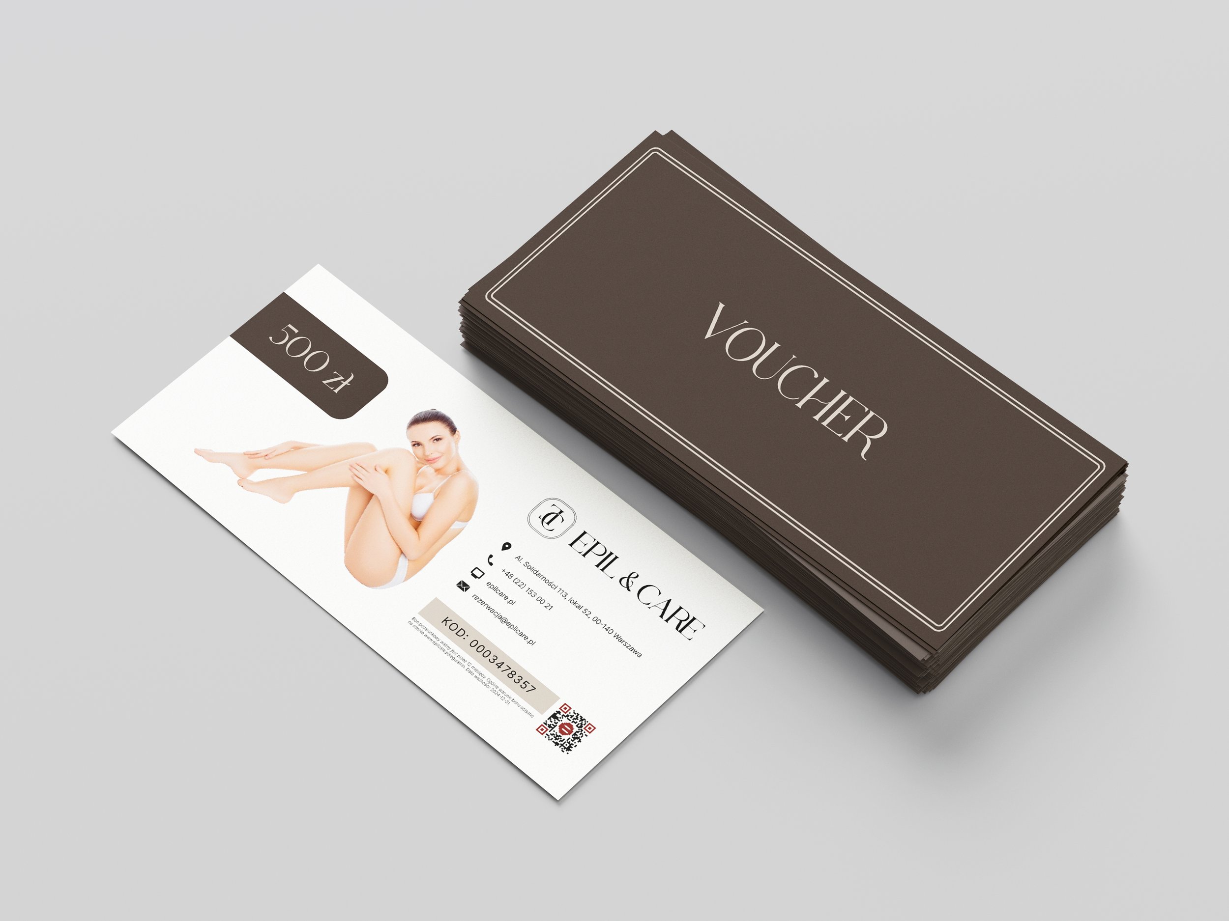
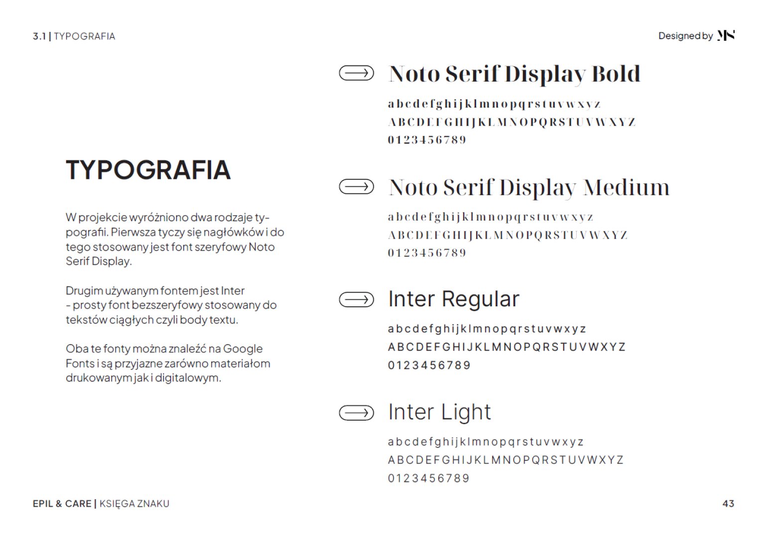
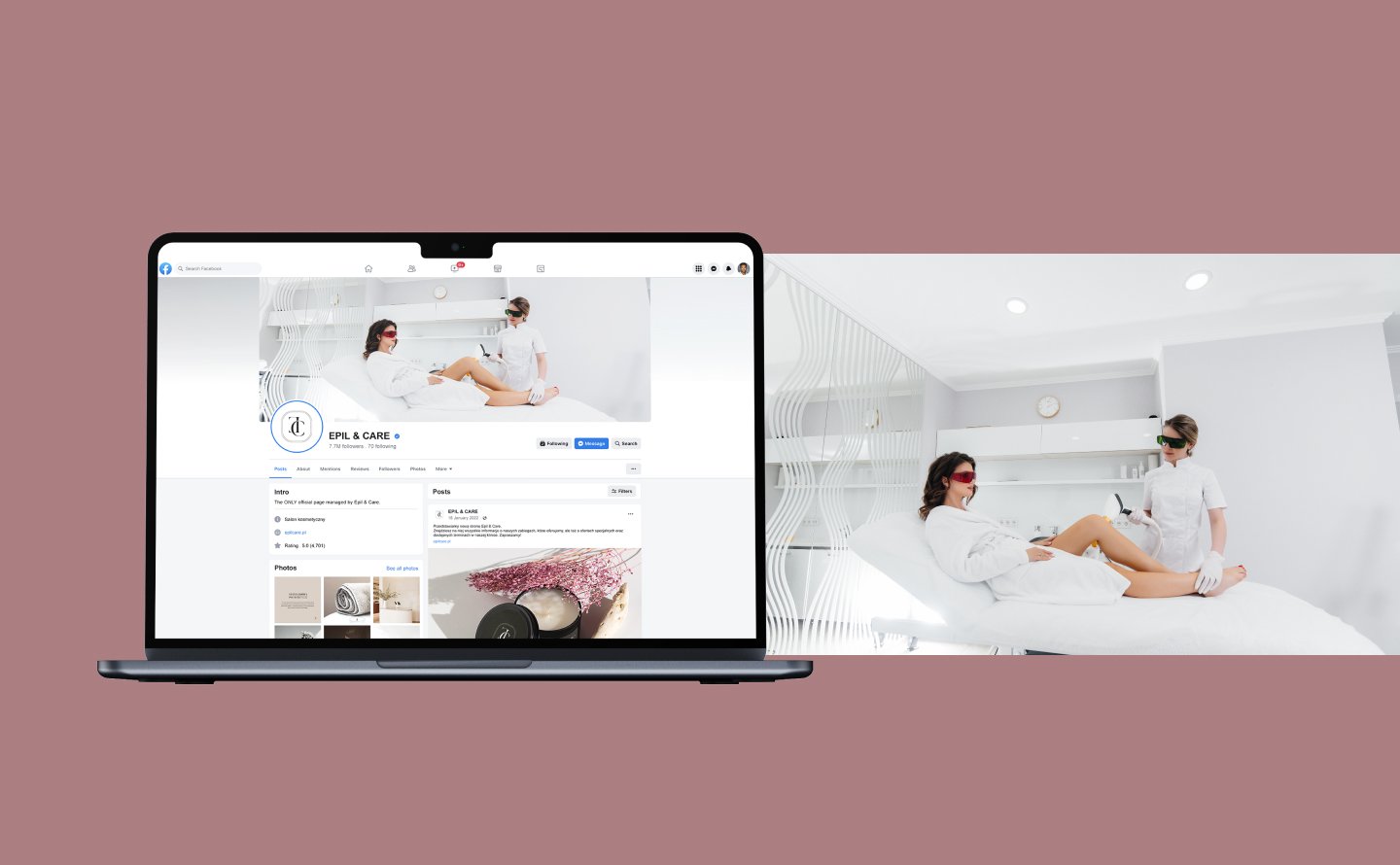
The project was based on the rebranding of the Epilcare brand, including changing the name to Epil & Care, creating a logo with a brand book, the entire visual identification, including printed and digital materials, and graphic support in creating a new website and social media.
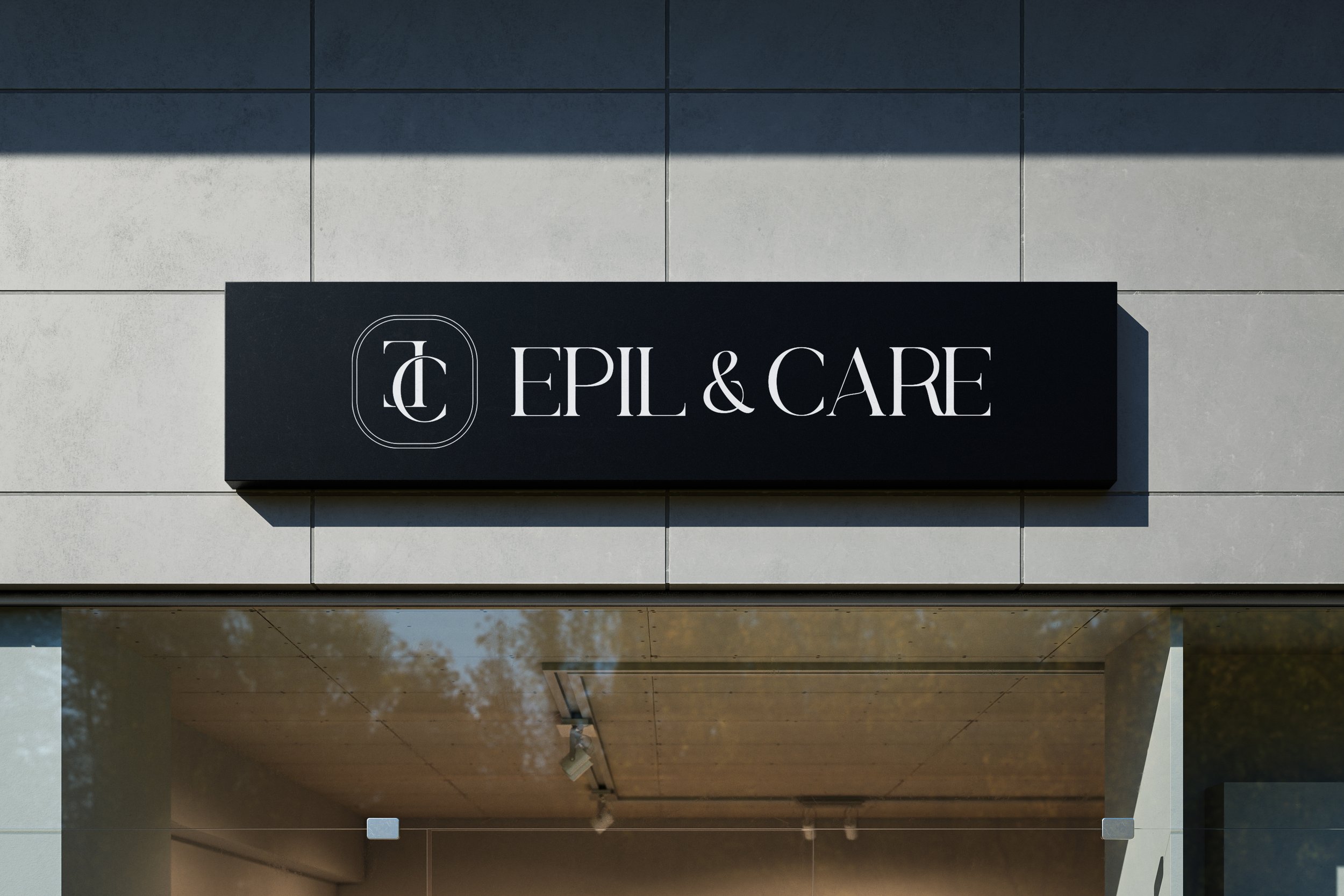
Key directions: luxury, medical emphasis, privacy, trustfemininity, minimalism
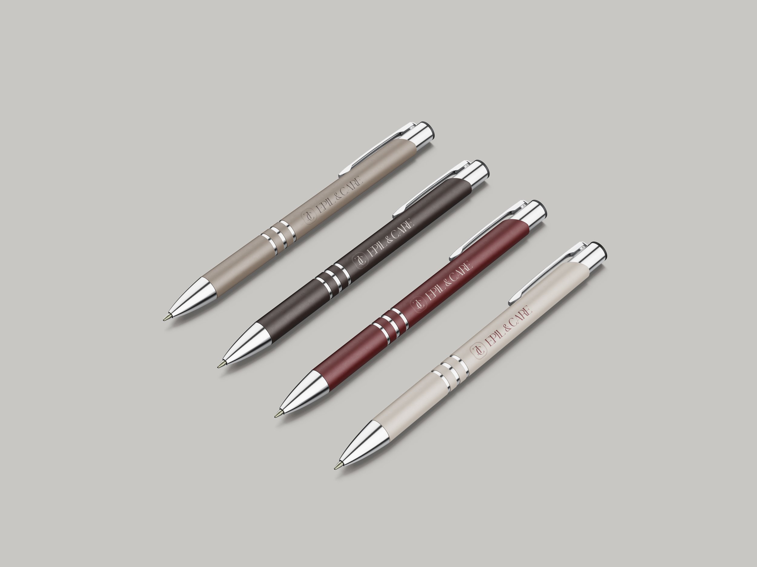
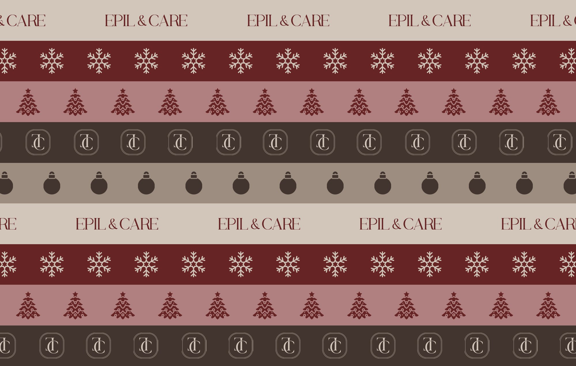
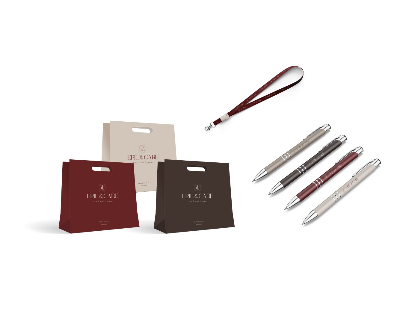
SOLUTION
The purpose of rebranding and creating a new visual identification of the brand was to communicate the Epil & Care philosophy. To achieve this, a diversified color palette and a combination of elegant, serif typography and a simple sans-serif typeface were used. The brand's colors are based on natural shades of brown, beige and burgundy. The lack of bright colors creates an atmosphere of calm and comfort, and also gives the character of a premium brand.